Selected work01 / 10
SIROTER
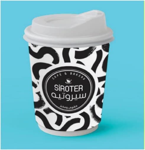
A black-and-white pattern system that turns every coffee cup into a small poster.
01
The challenge
SIROTER needed takeaway cups and cold-drink glasses that could be recognised from across the street, without relying on colour or an oversized logo.
02
The idea
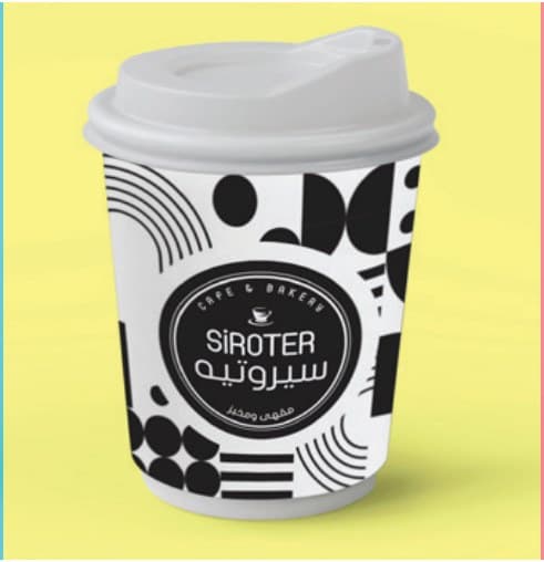
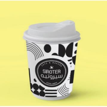
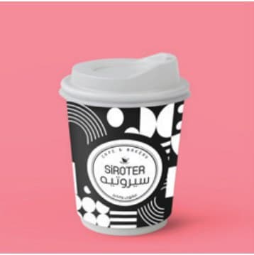
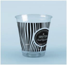
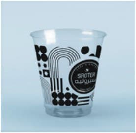
Make the pattern the brand. A family of bold black-and-white graphics (waves, dots, stripes and geometric cuts) carries the SIROTER badge, so every cup looks different yet unmistakably the same.
03
The execution
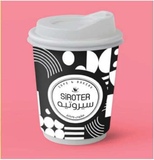
The system was applied to hot cups, lids and clear cold-drink cups, with the badge centred on each pattern and tested against bright backdrops to keep the contrast strong.
04
The impact
A packaging range that photographs well, stacks well and works as a social-media asset in its own right.

Next projectAREES Law FirmBranding & Identity